Vishal Singh · NYU Stern

Explore Interactive apps, data-stories, and case studies.

Teaching studios, apps, and data stories spanning public health, politics, business, and other public data. Filter by type or topic below — each piece opens in a new tab.

Browse by topic · 170 pieces

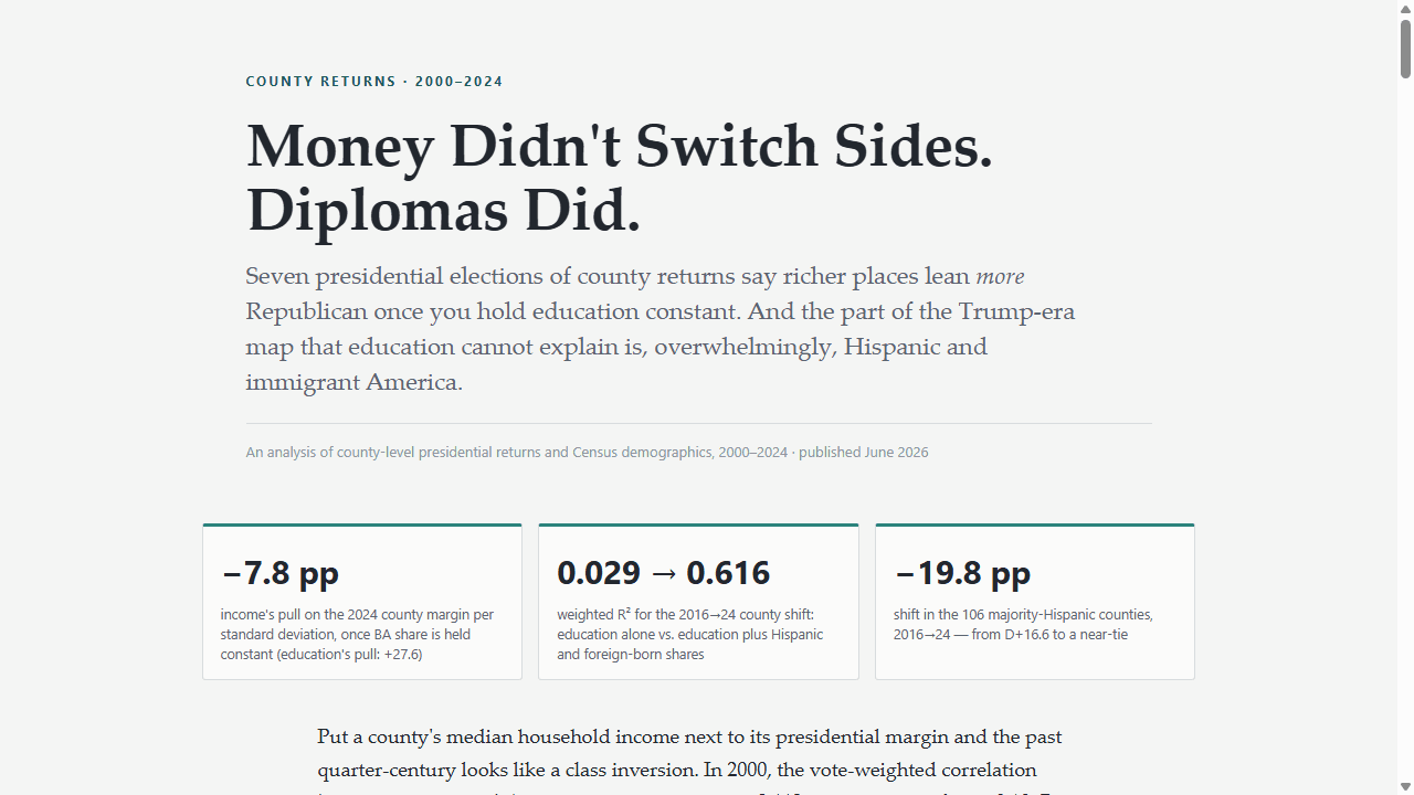
Presidential returns, county swings, turnout, and the electoral map — interactive atlases and data stories on how America votes.

App
Elections & Voting

The American Political Almanac · 1976–2024

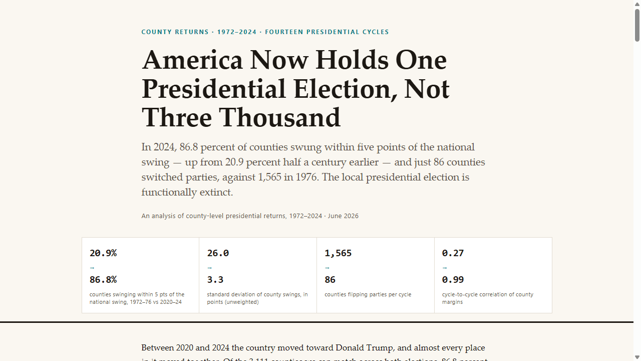
An interactive atlas of U.S. presidential elections, 1976–2024 — national, state, and county returns, demographics, and ANES survey shifts.

politicselectionsinteractive
BlogNew
Elections & Voting

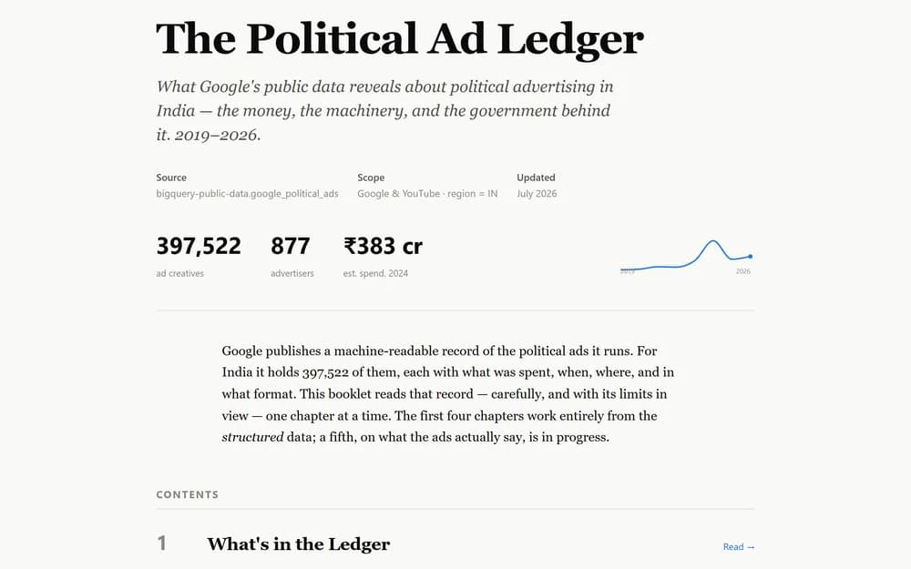
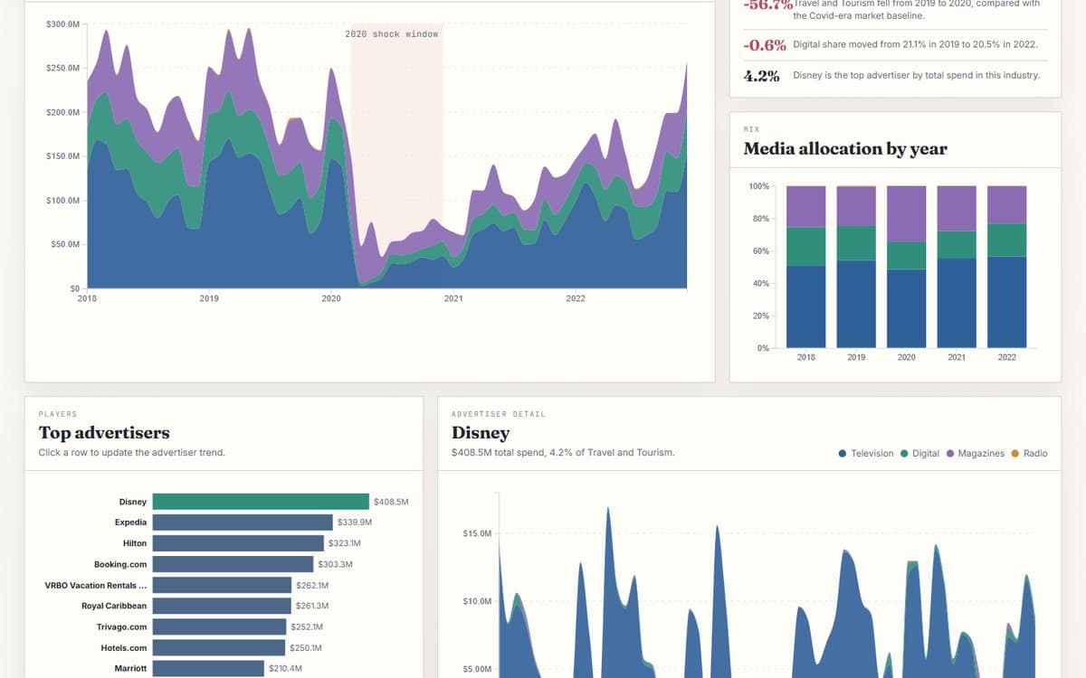
The Political Ad Ledger

A data booklet on what Google's public political-ads dataset reveals about political advertising in India, 2019–2026: the money, the machinery, and the government behind it.

Text analysisAdministrative dataTrend analysis
Blog
Elections & Voting

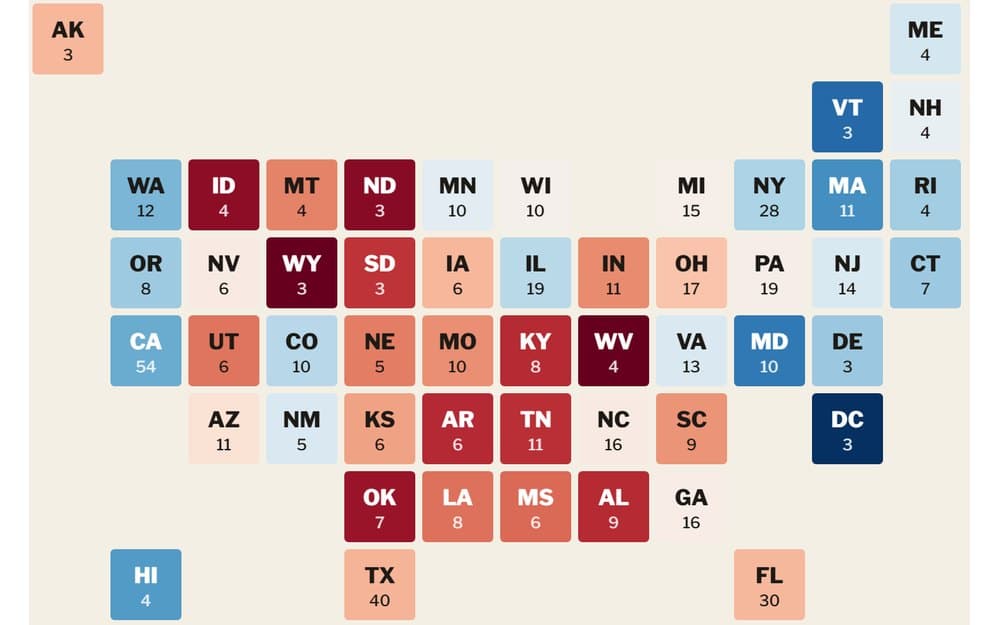
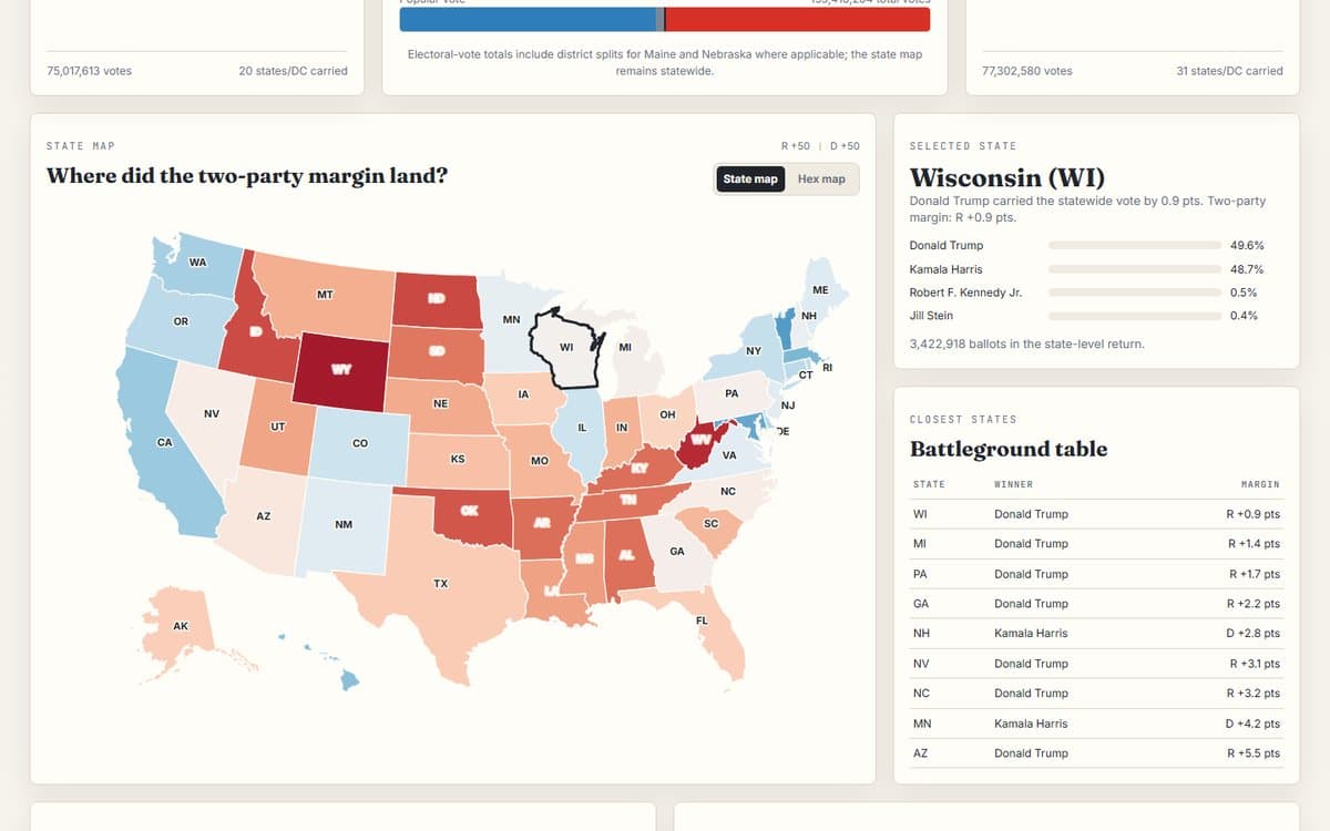
Presidential Election Atlas: 1976-2024

A state-by-state presidential election dashboard: move across 1976-2024, compare national outcomes, read the hex map, and inspect which states shifted most from the prior election.

ChoroplethElection returnsDashboard
BlogNew
Elections & Voting

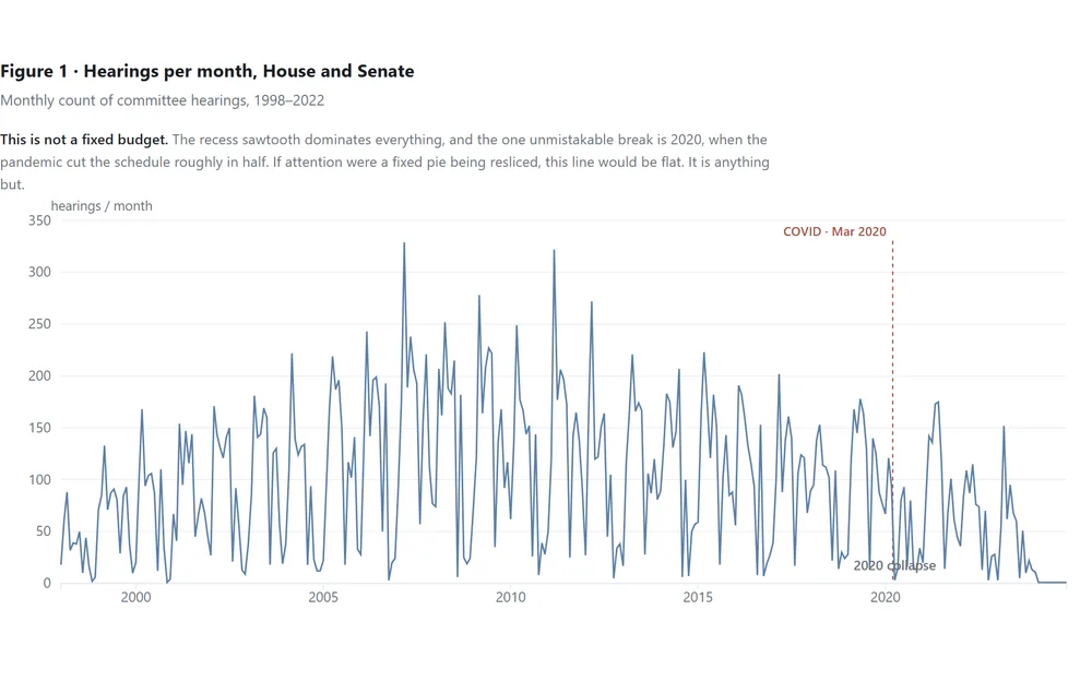
The Attention Budget That Wasn't

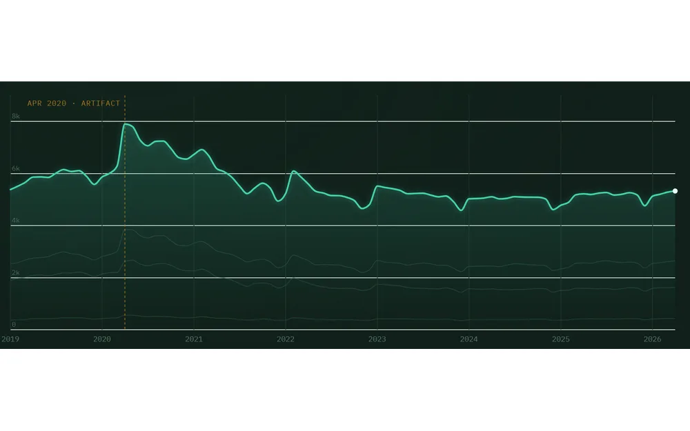
We expected Congress to have a fixed attention budget that crises reallocate. Across 25 years of hearings, it doesn't — the calendar rules, most shocks never register, and only a pandemic emptied the schedule.

Shock analysisTrend analysisTime series
BlogNew
Elections & Voting

The Floor Time Gap

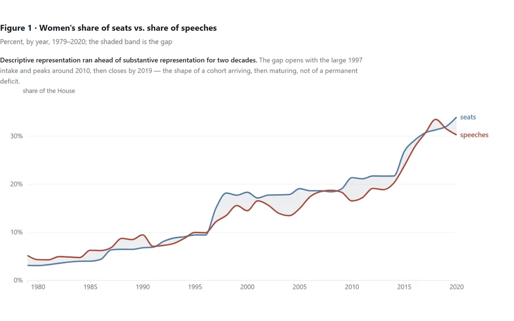
2.7 million Commons speeches: women won seats faster than they won the floor. But the gap was never that women speak less — it was who gets to be the busiest voice in the room.

Trend analysisDecompositionRanking
BlogNew
Elections & Voting

The Mainstreaming Clock

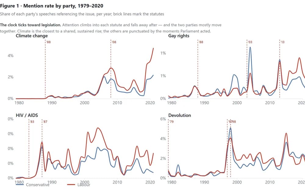
2.7 million Commons speeches, 1979–2020: issues enter the parliamentary record on the schedule of legislation, not ideology — and the party talking most is usually the one holding the pen.

Text analysisTrend analysisTime series
See all 18 in Elections & Voting

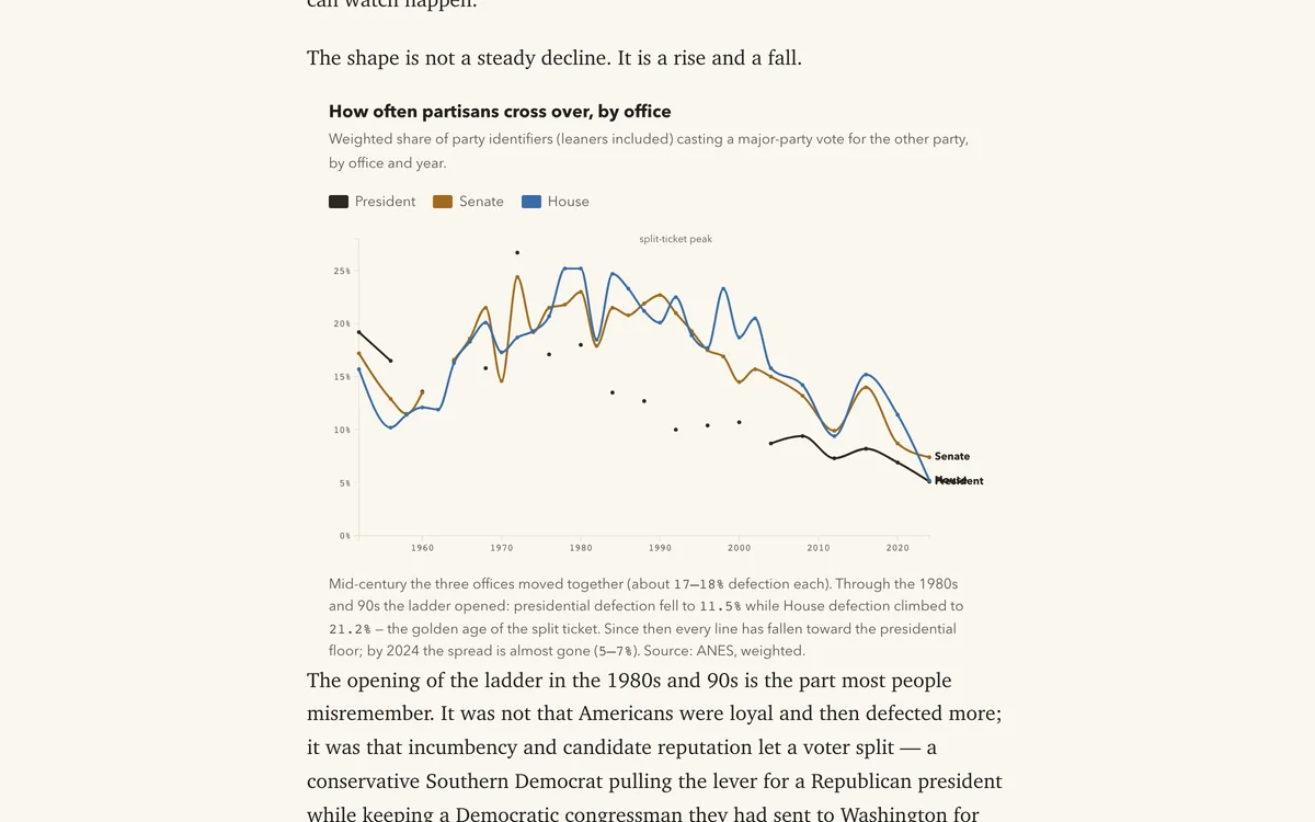
Party sorting, attitude gaps, and long-run survey trends — how American opinion divides, shifts, and hardens across groups and decades.

Blog
Polarization & Public Opinion

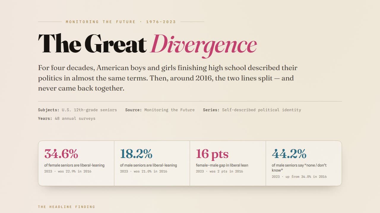
The Great Divergence: Teen Political Identity

Track how U.S. high school seniors describe their political identity from 1976-2023, with gender gaps, ideological spectrum shifts, and post-2016 decomposition views.

Survey analysisTrend analysisDecomposition
BlogNew
Polarization & Public Opinion

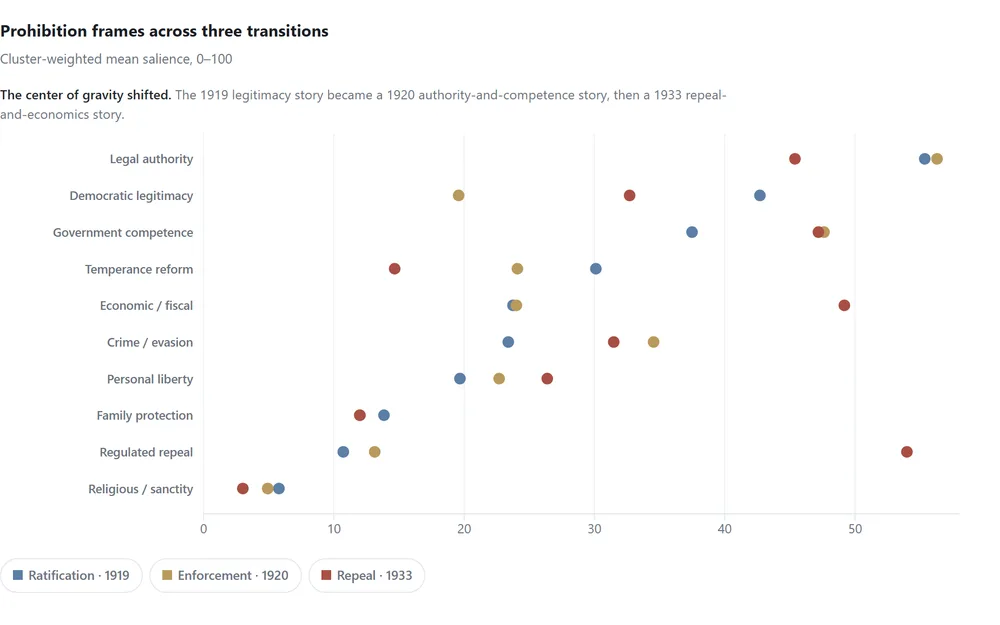
How a Moral Crusade Became a Governance Problem

Prohibition entered the Constitution through moral reform and democratic legitimacy. Fourteen years later, newspapers buried it under economics, administration, and regulated repeal.

BlogNew
Polarization & Public Opinion

Communities Have Emotional Fingerprints

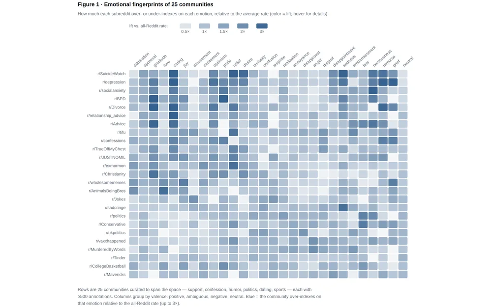
211,225 human judgments of Reddit comments reveal that communities run on distinct emotions — and that humans can't agree on what grief looks like.

Text analysisSegmentationNetwork
Blog
Polarization & Public Opinion

The Diploma Divide Comes for the Prom — Teen Politics by Sex and Parental Education, 1976–2024

The “Trump effect” on teenage politics is usually told as a story about boys and girls. Follow half a million high school seniors across five decades and a second fault line appears: whose parents went to college. After 2016, daughters o…

Trend analysisSurvey dataPanel data
BlogNew
Polarization & Public Opinion

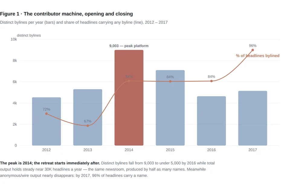
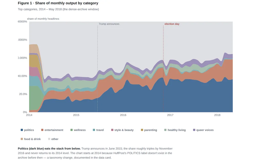
When Politics Ate the Newsroom

209,527 HuffPost headlines, 2012–2022: politics triples its share of the newsroom, the listicle dies, and you can date the arrival of every word.

Text analysisTrend analysisTime series
Blog
Polarization & Public Opinion

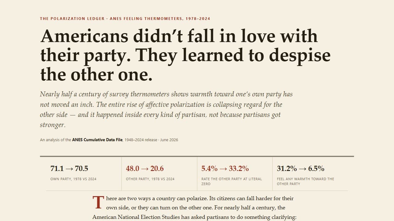
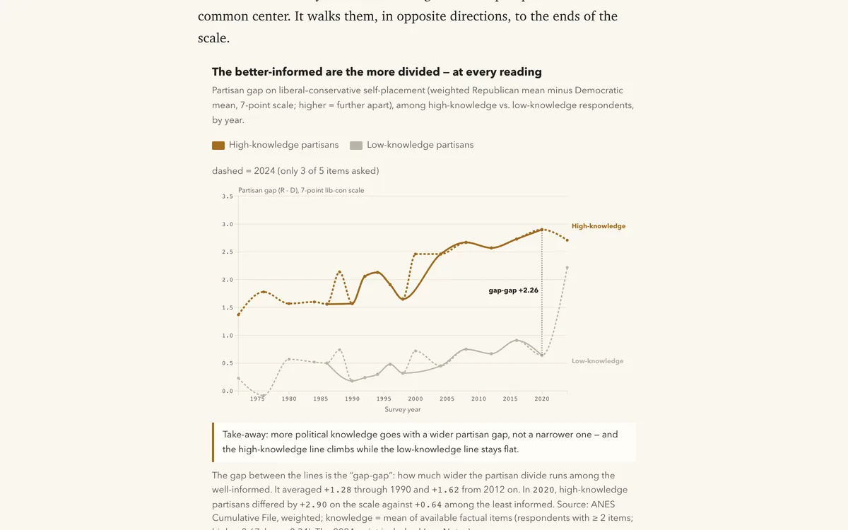
America Didn’t Wait for the Unsorted to Die — They Switched

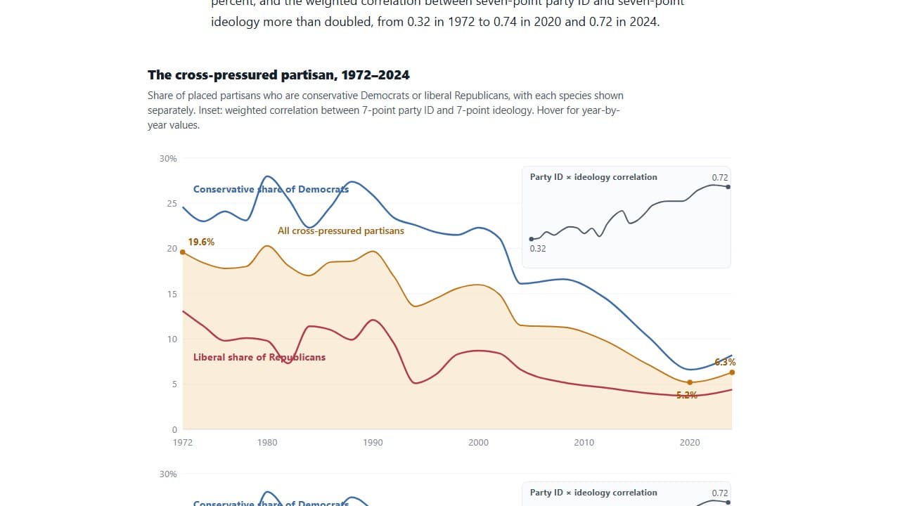
Track ANES cross-pressured voters from 1972-2024 to test whether partisan sorting came from generational replacement or switching among existing cohorts.

DecompositionSurvey analysisSurvey data
See all 21 in Polarization & Public Opinion

Life expectancy, overdose deaths, chronic disease, and the geography of health across states, counties, and ZIP codes.
App
Health & Mortality

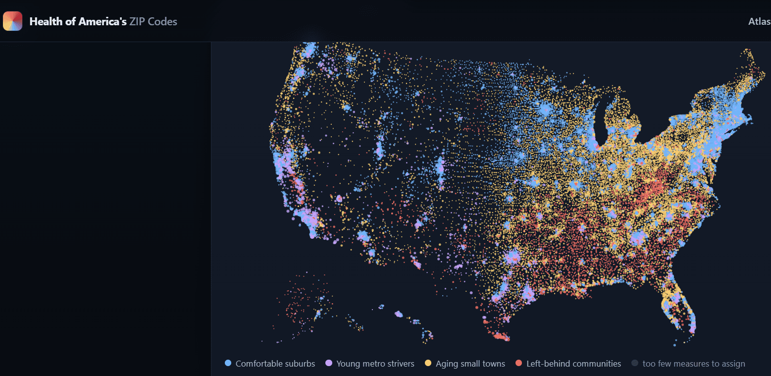
Health of America’s ZIP Codes

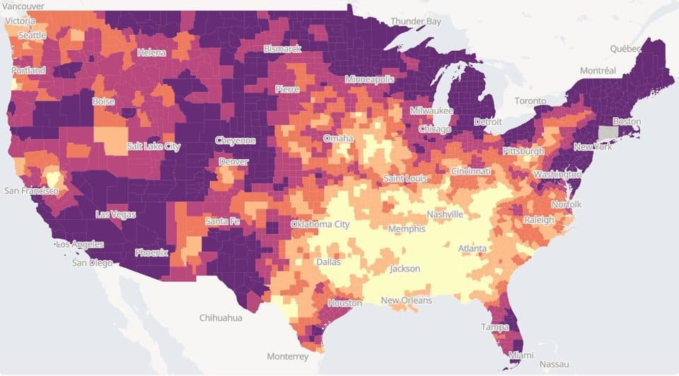
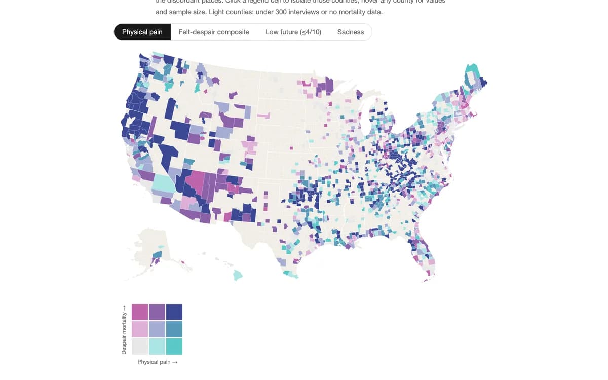
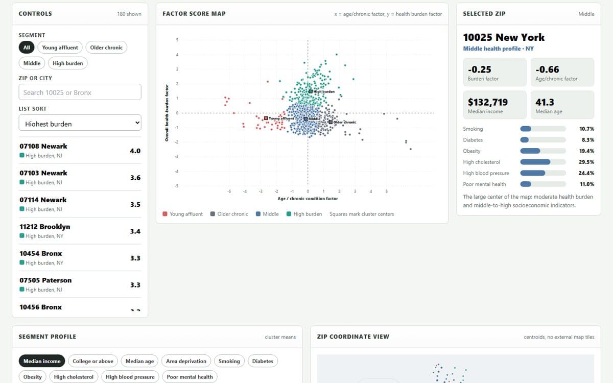
A map-first atlas of 26 health and social-need measures across 32,409 ZIP/ZCTAs (CDC PLACES + Census), with stories and methodology.

public-healthzipplaces
Blog
Health & Mortality

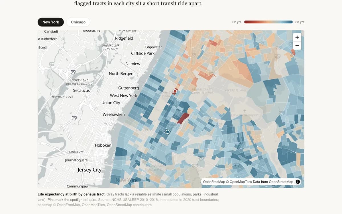
Four Subway Stops, Twenty-Four Years

Within a single American county, life expectancy at birth can differ by more than two decades. A tract-level tour of New York and Chicago.

ChoroplethHealth / mortality dataGeospatial analysis
Blog
Health & Mortality

Safer and More Afraid — The Paradox of Violence in American Schools, 1991–2023

By every measure of actual violence, American high schools are far safer than in the 1990s: fights cut in half, weapons on campus down two-thirds. Yet the share of students too afraid to go to school at all has tripled. Thirty years of d…

Trend analysisSurvey analysisInequality analysis
Blog
Health & Mortality

Scars That Don't Show — Bullying and the Mental Health of American Teens

One in four American high schoolers is bullied — in the hallway, on the phone, or both. The bruises are rare. The despair is not: bullied teens report sadness, suicidal thinking, and suicide attempts at rates two to six times higher than…

Survey analysisRegressionDistribution
Blog
Health & Mortality

The Great Sadness — Three Decades of Teen Mental Health, 1991–2023

Around 2011, something broke. After a decade of stable — even improving — mental health, American teenagers, and especially teenage girls, began reporting sadness and suicidal thinking at rates the CDC’s survey had never recorded. By 202…

Trend analysisTime seriesSurvey analysis
Blog
Health & Mortality

The Sleep Recession — American Teens and the Eight-Hour Night, 2007–2023

Pediatricians say teenagers need eight to ten hours of sleep. In 2007, fewer than a third of American high schoolers got even the minimum on a school night. Sixteen years later it is fewer than a quarter — and the students getting five h…

Trend analysisTime seriesSurvey analysis
See all 22 in Health & Mortality

Life satisfaction, time use, stress, and social connection — what large surveys reveal about how Americans are actually doing.
Blog
Happiness & Well-Being

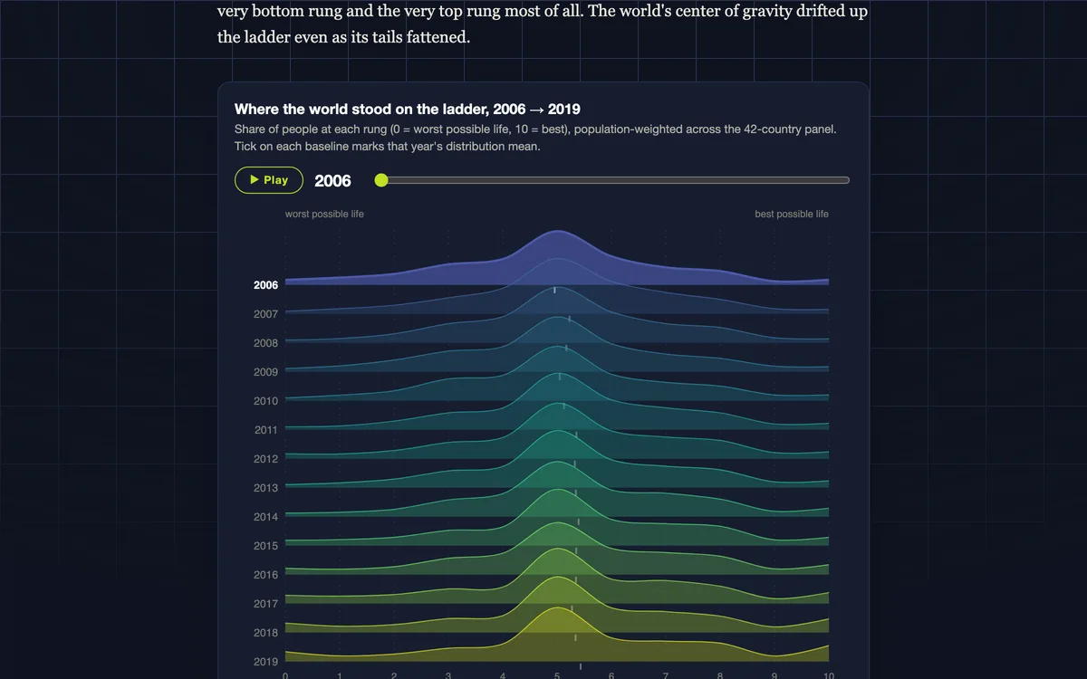
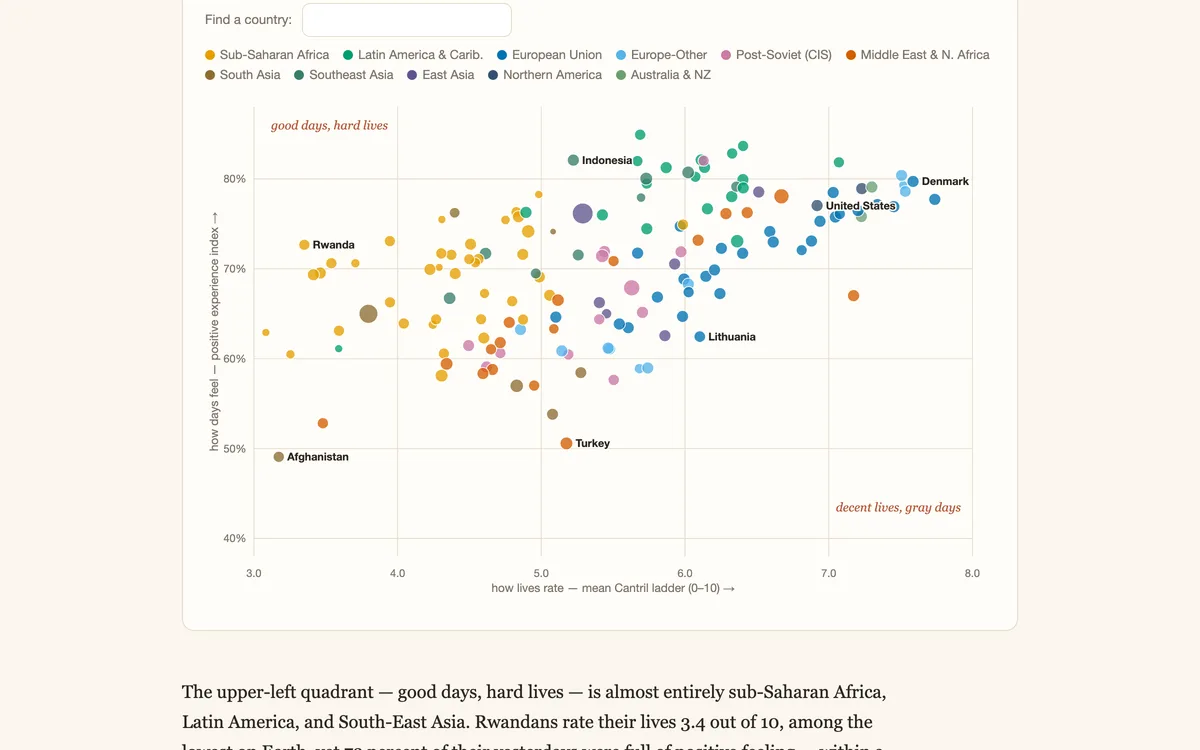
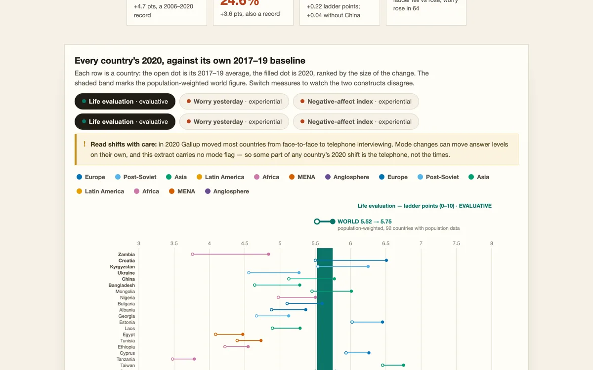
2020: The World's Worst Year?

Gallup World Poll, 93 countries: in 2020 daily worry, sadness and stress hit their highest recorded levels, while the world’s rating of its own life barely moved.

Shock analysisSurvey analysisScatter plot
Blog
Happiness & Well-Being

The Well-Being Atlas

A publication of reproducible data essays on life satisfaction — Gallup World Poll, GSS, and WVS microdata across 50 years and 168 countries.

Survey analysisChoroplethSurvey data
Blog
Happiness & Well-Being

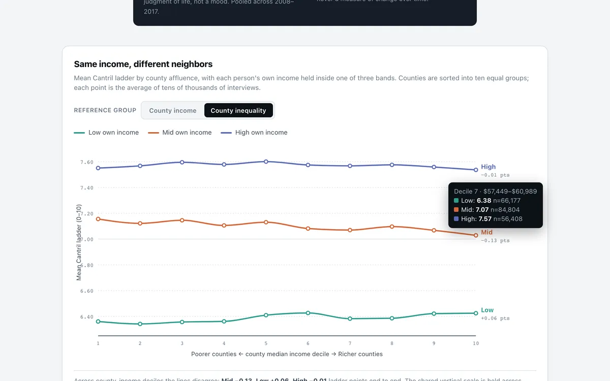
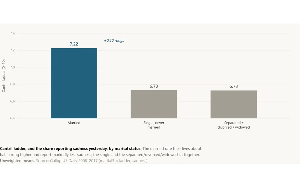
Alone Together

A partner is worth about half a rung of the Cantril ladder, and the premium survives wherever you live. But a civic-rich county does not rescue the isolated — the married-vs-unmarried gap is the same in high-social-capital places and low…

RegressionInequality analysisBenchmarking
Blog
Happiness & Well-Being

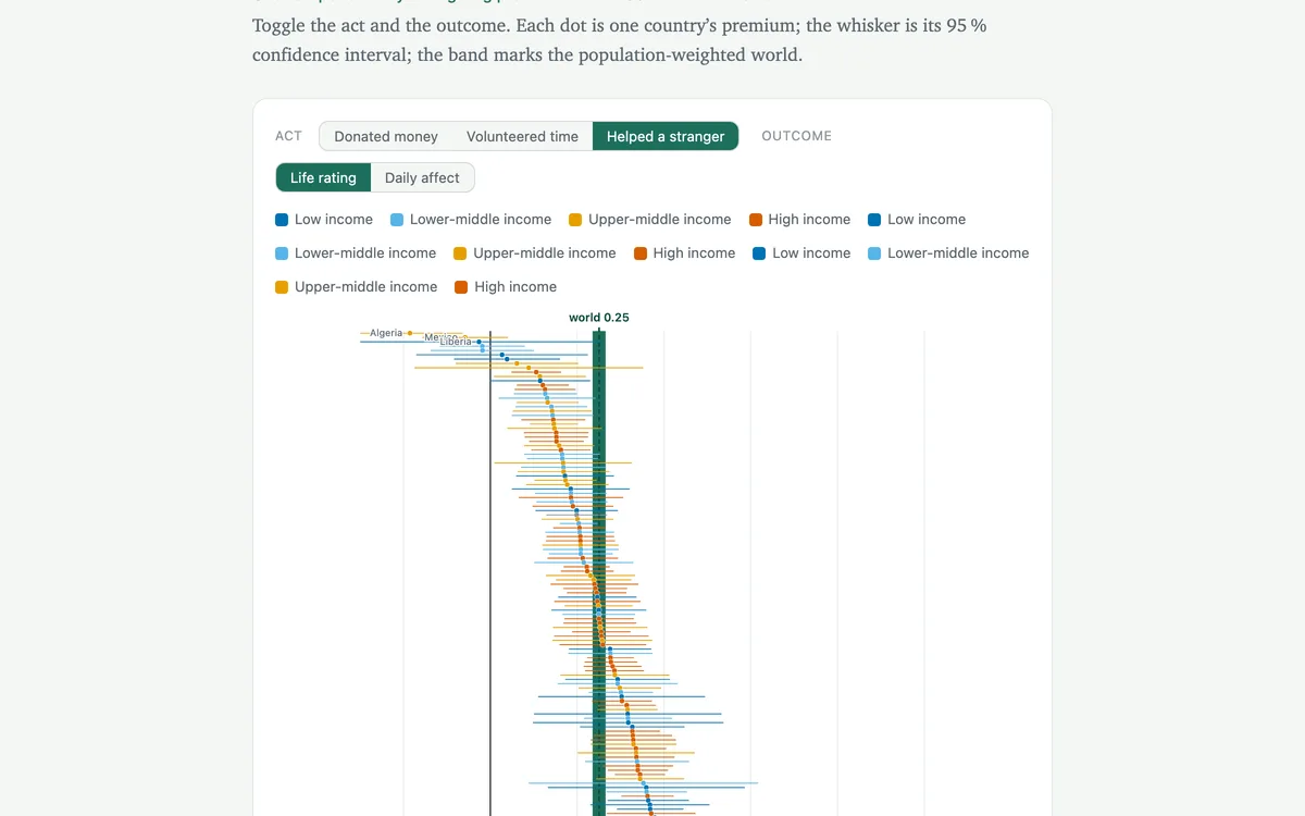
Does Generosity Pay - Everywhere?

Across 155 countries, people who give — money, time, or a hand to a stranger — rate their lives higher and feel better day to day. The link is remarkably stubborn: it holds in rich countries and poor ones alike, and it is strongest for g…

RegressionSurvey analysisSurvey data
Blog
Happiness & Well-Being

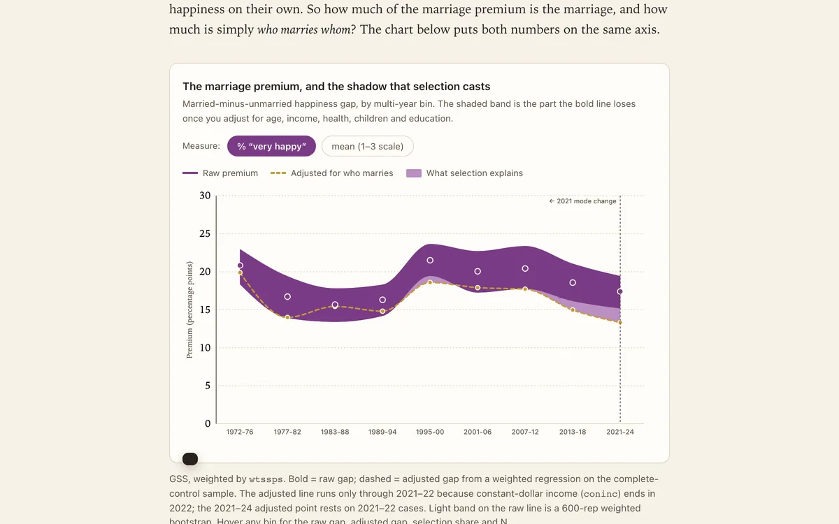
Does the Ring Still Matter?

For fifty years, married Americans have reported being happier than everyone else. The gap has barely budged — and most of it survives even after you account for who tends to marry.

Survey dataDecompositionRegression
Blog
Happiness & Well-Being

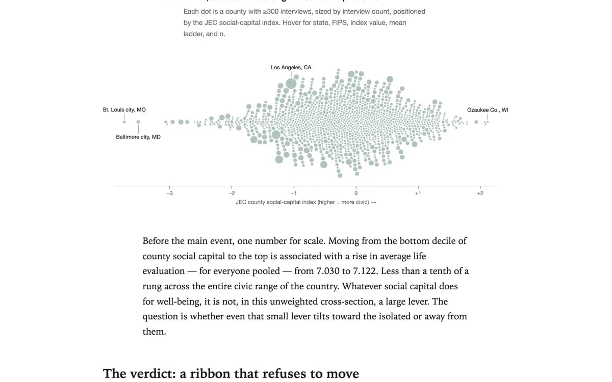
Does Community Substitute for Connection?

Putnam's heirs promised that civic fabric lifts everyone. Three and a half million Gallup interviews ask the sharper question: does it lift the people who need it most?

Inequality analysisIndex constructionRegression
See all 21 in Happiness & Well-Being

Pricing, competition, advertising, and market structure — data stories and teaching cases from the business world.
App
Business & Markets

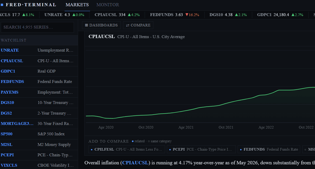
Chat FRED

Chat with the Federal Reserve Economic Data API. Explore economic indicators, time series, and datasets through natural conversation—powered by cached data for instant responses.

FREDAPIeconomics
Teaching
Business & Markets

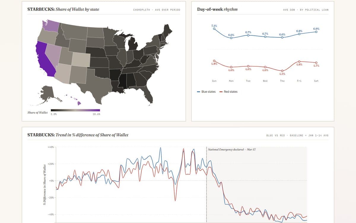
Fast-Food Share of Wallet: COVID Impact

How did the pandemic redraw where consumers spent their fast-food dollars? A share-of-wallet dashboard that benchmarks chains against the category through the shock and recovery.

DashboardBenchmarkingShock analysis
Teaching
Business & Markets

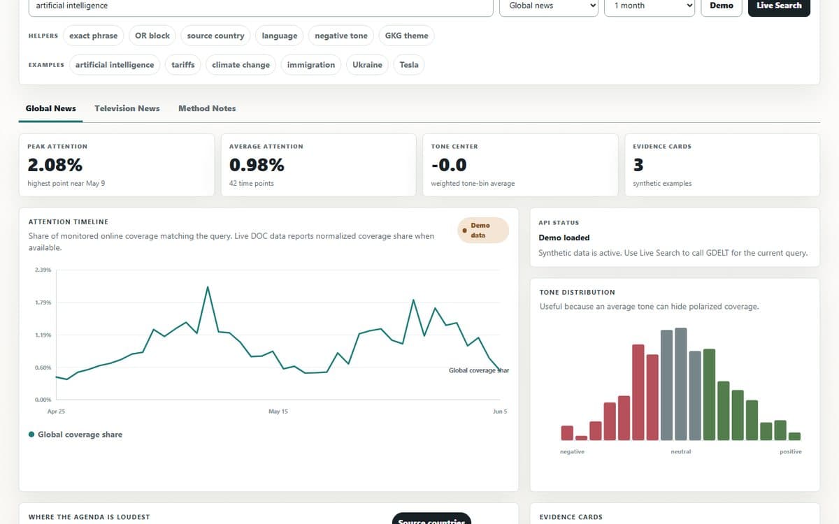
GDELT Media Agenda Lab

Search global news and television coverage as an agenda-setting lab: compare attention, tone, source geography, station airtime, and evidence cards from live GDELT APIs.

DashboardText analysisLive API
App
Business & Markets

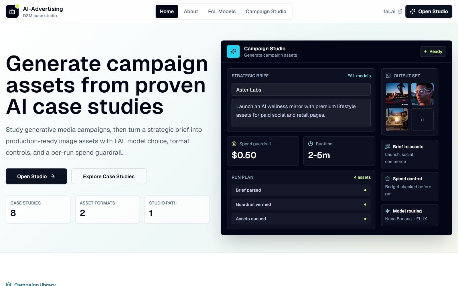
FAL Campaign Studio — AI Marketing Case Studies

Teaching case studies and FAL-powered tools for generative AI in creative marketing — study real campaigns, then turn a strategic brief into production-ready image assets.

aiadvertisinggenerative
Teaching
Business & Markets

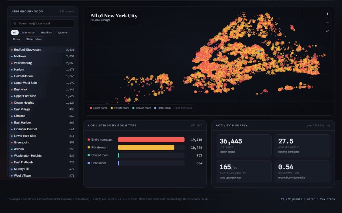
NYC Airbnb: A Listings Atlas

Explore tens of thousands of NYC listings by neighborhood, room type, and price — a worked example of how exploratory views turn a raw marketplace dump into a map of where supply and money actually sit.

DashboardMapsExploratory viz
Teaching
Business & Markets

The Southwest Effect

Does a low-cost carrier entering a route really pull fares down — and by how much, once you hold distance and demand fixed? A visual walk through the classic regression.

RegressionDashboardControls
See all 24 in Business & Markets

Spending, saving, debt, and financial fragility — how American households earn, borrow, and manage money.
BlogNew
Consumer & Household Finance

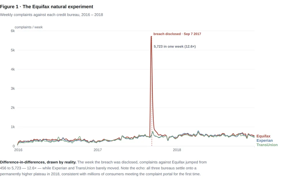
The Complaint Machine

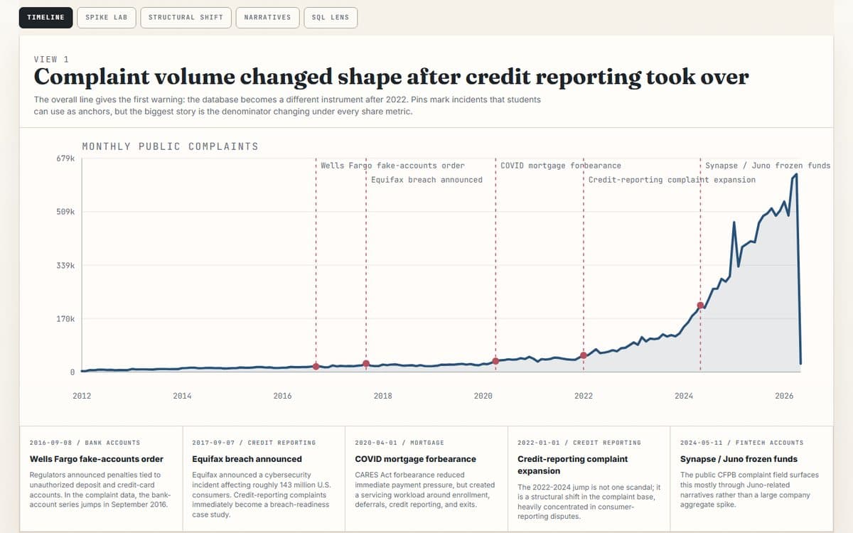
16.7 million CFPB complaints: the cleanest natural experiment in consumer finance, and a database that one product category swallowed whole.

Text analysisCausal inferenceTrend analysis
BlogNew
Consumer & Household Finance

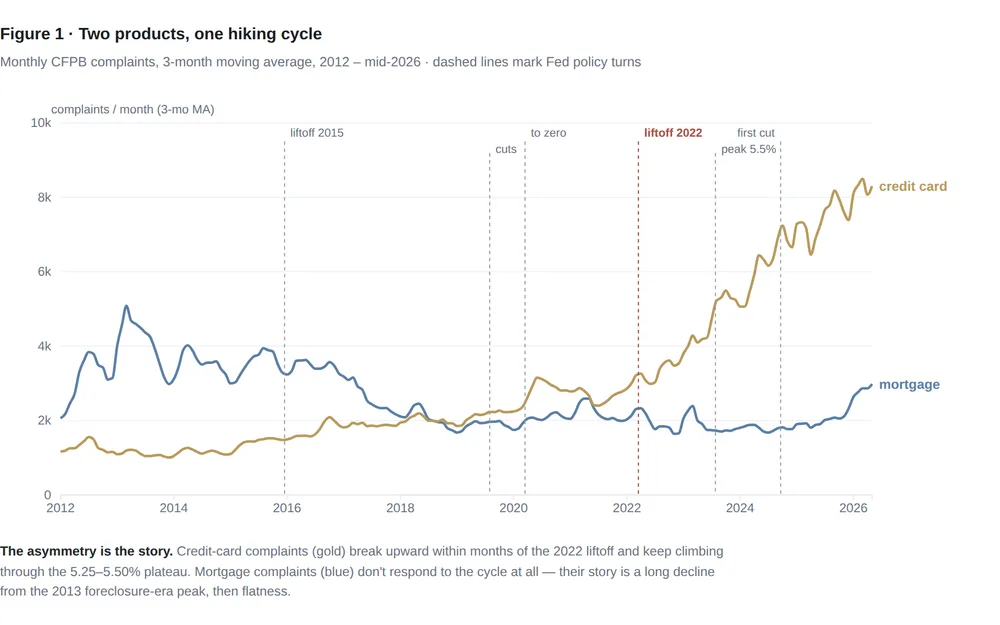
The Fed Hiked. Your Credit Card Noticed.

Fourteen years of CFPB complaints show monetary policy reaching households through exactly one door: credit-card complaints triple after the 2022 hikes while mortgage complaints never move.

Shock analysisTime seriesCausal inference
BlogNew
Consumer & Household Finance

The January Echo

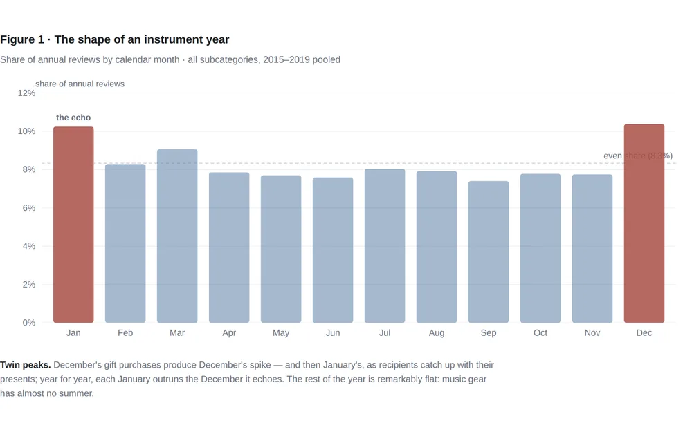
Amazon's musical-instrument reviews peak in January, not December — the sound of a million gifts being unboxed. Seasonality cleanly separates the instruments people give from the gear working musicians buy.

Text analysisTrend analysisScanner / CPG
Blog
Consumer & Household Finance

Feeling Rich Is Not the Same as Being Rich

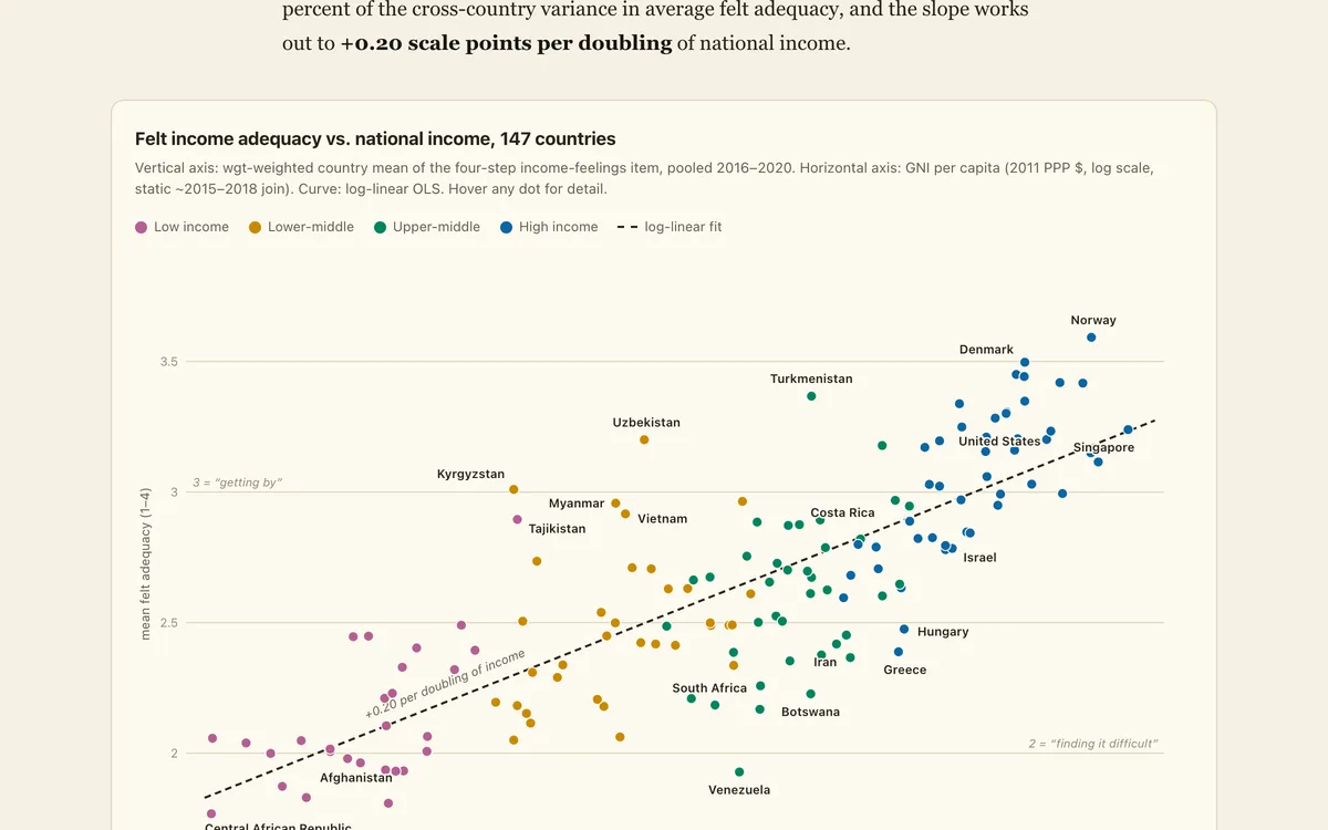
Across 147 countries, money reliably buys the feeling of financial sufficiency — and the feeling never tops out, across countries or within them. But whole regions feel far richer, or poorer, than their income says they should.

Inequality analysisRegressionSurvey data
Blog
Consumer & Household Finance

The Peak and the Plateau — A Decade of American Financial Well-Being

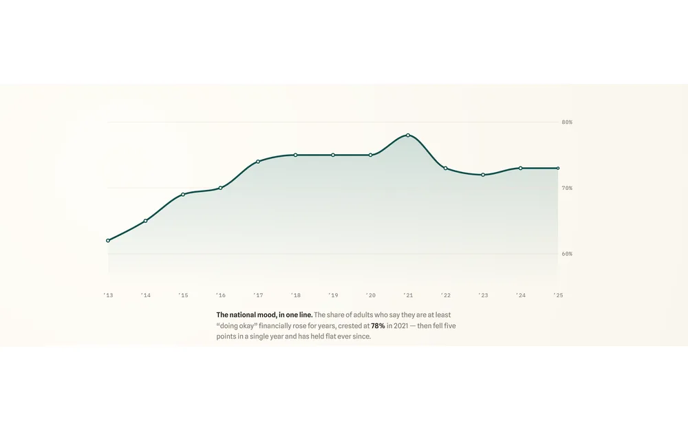
For a decade, Americans felt steadily better about their money. Then 2022 took it back — and the recovery never came.

Survey analysisTrend analysisInequality analysis
Dataset
Consumer & Household Finance

Zillow state ZHVI panel

Wide state-level Zillow Home Value Index panel with monthly columns from 2000 through 2026.

housingtime seriesstate panel
See all 9 in Consumer & Household Finance

Income and wealth gaps, economic mobility, and who gets ahead — evidence across places, cohorts, and generations.
Blog
Inequality & Mobility

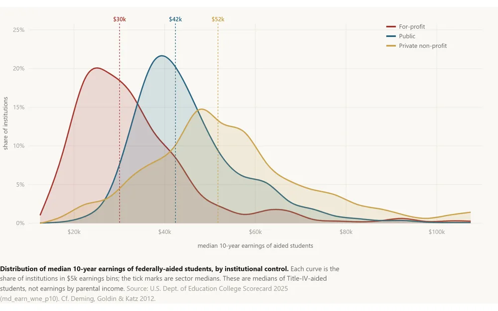
The Toll Booth

College is sold as the great equalizer. Across 6,400 U.S. institutions it looks more like a toll booth: a for-profit earnings penalty, a net-price schedule that bills a poor family a third of its income, and 2,200 counties with no four-y…

Geospatial analysisIndex constructionInequality analysis
AppNew
Inequality & Mobility

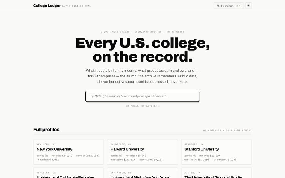
College Ledger — Every U.S. College, on the Record

Cost by family income, graduate earnings and debt, and three decades of trajectory for 6,273 accredited U.S. colleges — College Scorecard + IPEDS, shown honestly: suppressed is suppressed, never zero.

educationcollege-scorecardearnings
Blog
Inequality & Mobility

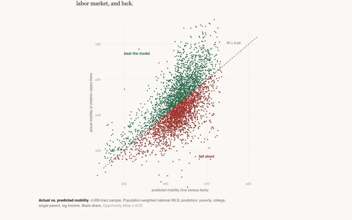
The Places That Beat the Model

A five-variable model predicts neighborhood mobility with R² = 0.44. The residuals are the interesting part: the counties that out-perform their demographics, and the boomtowns that don't.

BenchmarkingRegressionScatter plot
Blog
Inequality & Mobility

Raised Poor, Locked Up

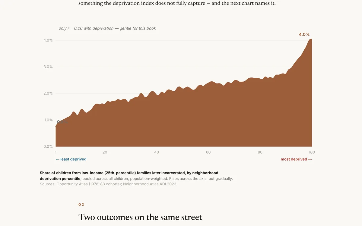
For boys raised by poor families, the odds of growing up incarcerated rise with neighborhood deprivation — and, on the very same streets, fall heavily by race.

Inequality analysisCorrelationScatter plot
Blog
Inequality & Mobility

The Born-Rich Premium

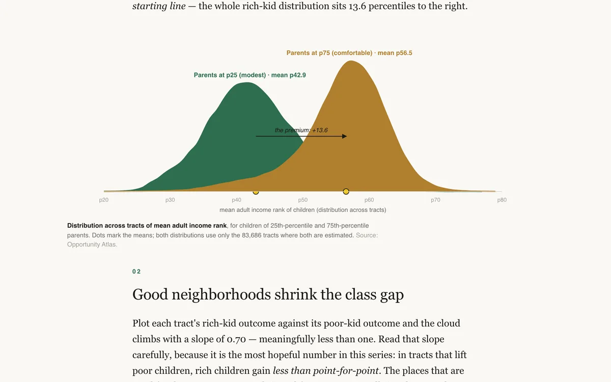
What does a rich birth buy? The Opportunity Atlas prices the class premium neighborhood by neighborhood — and it varies twofold across America.

RegressionChoroplethInequality analysis
Blog
Inequality & Mobility

The Company You Keep

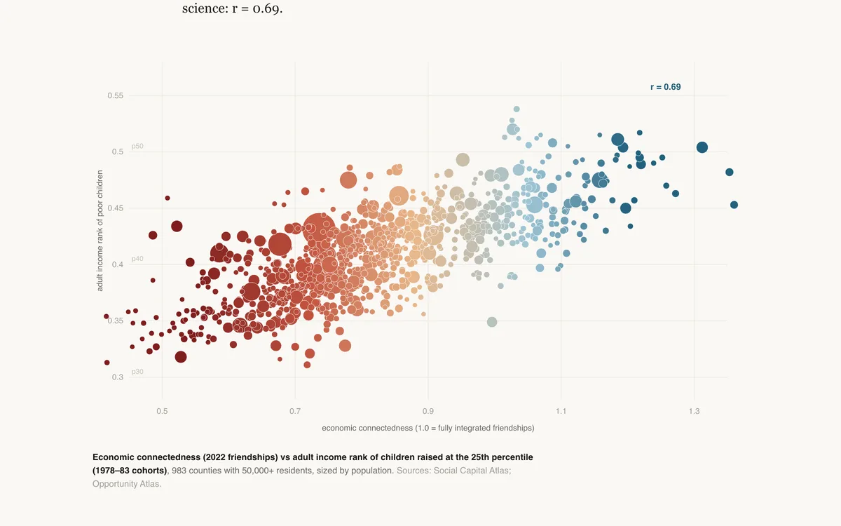
Twenty-one billion Facebook friendships, one question: which kind of social capital actually predicts whether poor children rise? Cross-class friendship does. Volunteering, clubs, and tight-knit networks barely register.

DecompositionScatter plotChoropleth
See all 7 in Inequality & Mobility

Population change, migration, family structure, and the social fabric — the long-run shifts beneath the headlines.
BlogNew
Demographics & Society

The University Shaped Like New York

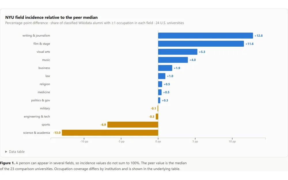
What Wikidata's selected archive of notable alumni says—and cannot say—about NYU and 23 U.S. comparison universities.

SegmentationBenchmarkingAdministrative data
BlogNew
Demographics & Society

Twenty-Four Universities, Five Fingerprints

A clustering case study of occupational fingerprints in Wikidata's selected archive of notable university alumni.

ClusteringDimensionality reductionBenchmarking
BlogNew
Demographics & Society

America Ran Out of Common Names

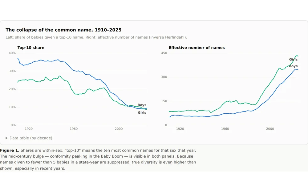
A century of Social Security records shows the quiet collapse of the common first name — and that name fads now burn out twice as fast as they used to.

Trend analysisTime seriesCensus / ACS
Blog
Demographics & Society

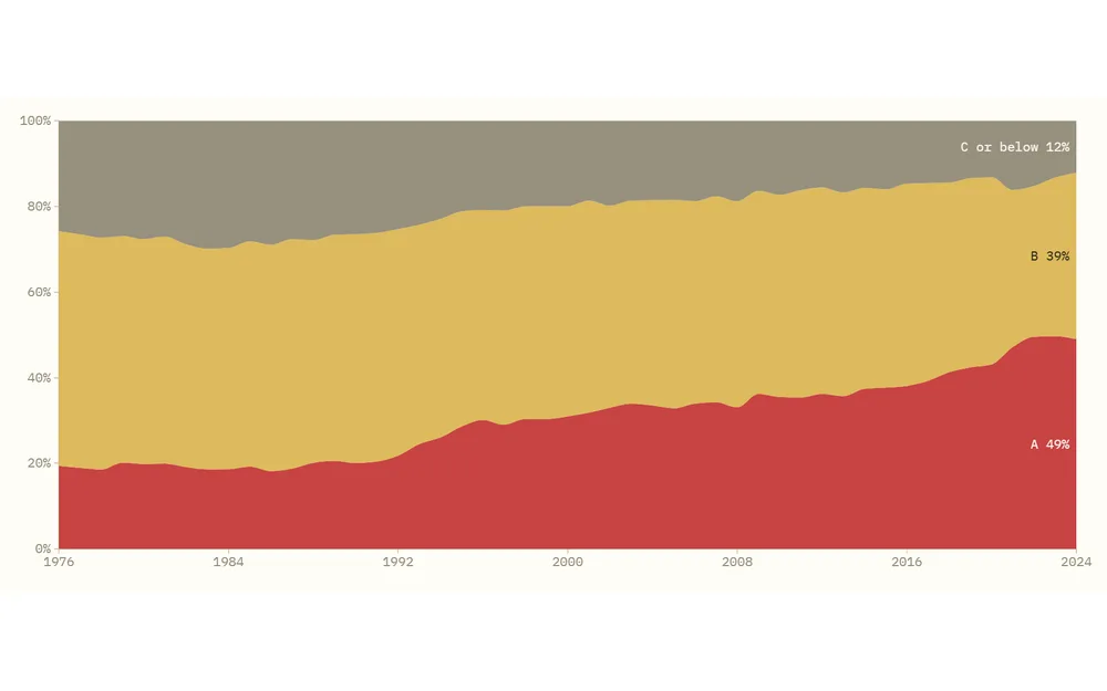
Lake Wobegon High — Fifty Years of Grade Inflation in American High Schools

In Garrison Keillor’s fictional town, all the children are above average. In actual American high schools, they are now mostly A students: the share of seniors reporting an A average has more than doubled since 1976, while truancy hasn’t…

Trend analysisTime seriesSurvey analysis
BlogNew
Demographics & Society

The Alumni Factory

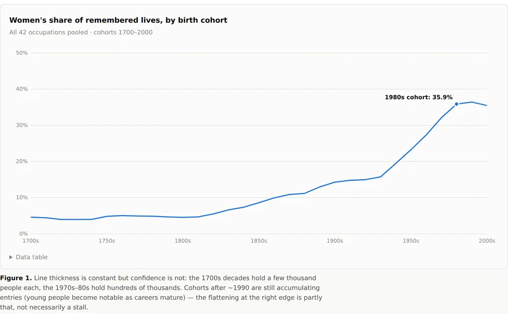
One million notable alumni of 250 institutions: what each school actually produces, and when its famous women finally appear.

Index constructionBenchmarkingPanel data
Blog
Demographics & Society

The Great Withdrawal — How American Teens Stopped Dating, Working, Drinking, and Going Out

Dating. Going out at night. The after-school job. The first beer. The first everything. Across fifty years of surveys, every classic marker of teenage social life is in retreat at once — most of them starting their slide around 2010, non…

Trend analysisSurvey analysisTime series
See all 16 in Demographics & Society

Religious affiliation, practice, and belief — the reshaping of American religious life, told through survey data.
Methods, AI & Data

28 pieces
BlogNew
Methods, AI & Data

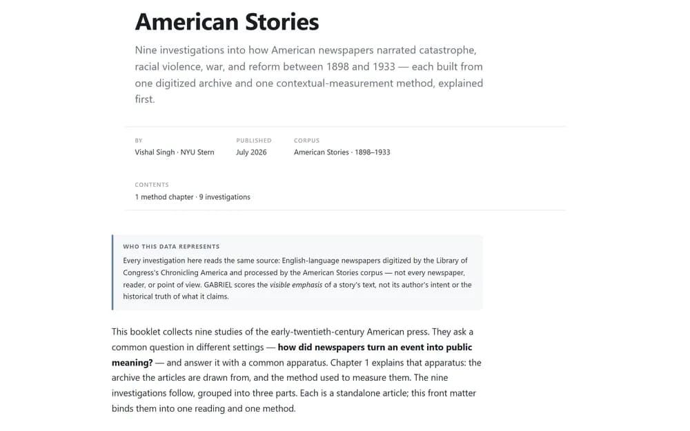
American Stories — A Booklet

A bound reading of nine American Stories investigations: how U.S. newspapers narrated catastrophe, violence, and reform between 1898 and 1933. Opens with the data and the GABRIEL method behind every article.

Text analysisIndex constructionTrend analysis
Blog
Methods, AI & Data

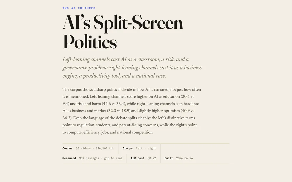
AI’s Split-Screen Politics

Left-leaning channels cast AI as a classroom, a risk, and a governance problem; right-leaning channels cast it as a business engine, a productivity tool, and a national race.

Text analysisClassificationSegmentation
App
Methods, AI & Data

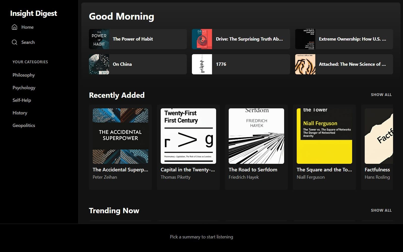
Insight Digest

AI-generated book summaries to read or listen to — across philosophy, psychology, self-help, history, and geopolitics.

aibook summariesaudio
App
Methods, AI & Data

Worldlines — The World in Numbers

A cross-country indicators explorer — 85 measures of development, democracy, belief, and wellbeing across 217 countries (1750–2025), with country profiles, rankings, and peer benchmarking.

indicatorscross-countryworld-bank
TeachingNew
Methods, AI & Data

Beyond the Stochastic Parrot — Chomsky, LLMs, and the Nature of Meaning

An interactive essay on the stochastic-parrot debate: what Chomsky claims, how language models actually work, and what the evidence says about machine understanding.

Text analysisClassificationBenchmarking
TeachingNew
Methods, AI & Data

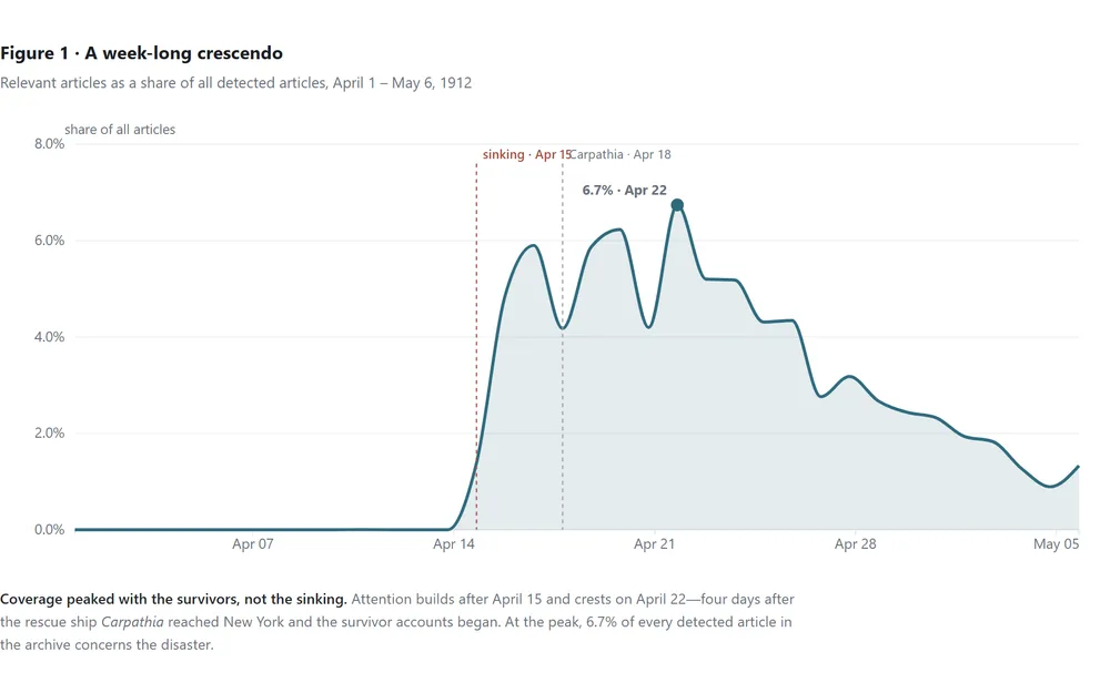
The Dead They Didn't Count

18,863 newspaper articles show how the American press framed the Titanic: quick to blame the company and mourn the spectacle, but nearly silent on the immigrant poor in steerage who died in the greatest numbers.

See all 28 in Methods, AI & Data