Health & Mortality
Life expectancy, overdose deaths, chronic disease, and the geography of health across states, counties, and ZIP codes.
17 pieces
 App
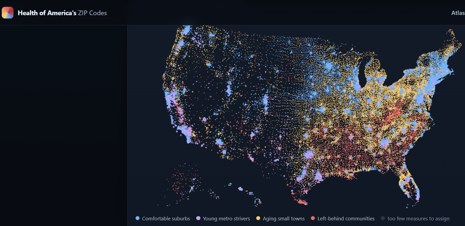
AppHealth of America’s ZIP Codes
A map-first atlas of 26 health and social-need measures across 32,409 ZIP/ZCTAs (CDC PLACES + Census), with stories and methodology.
 Blog
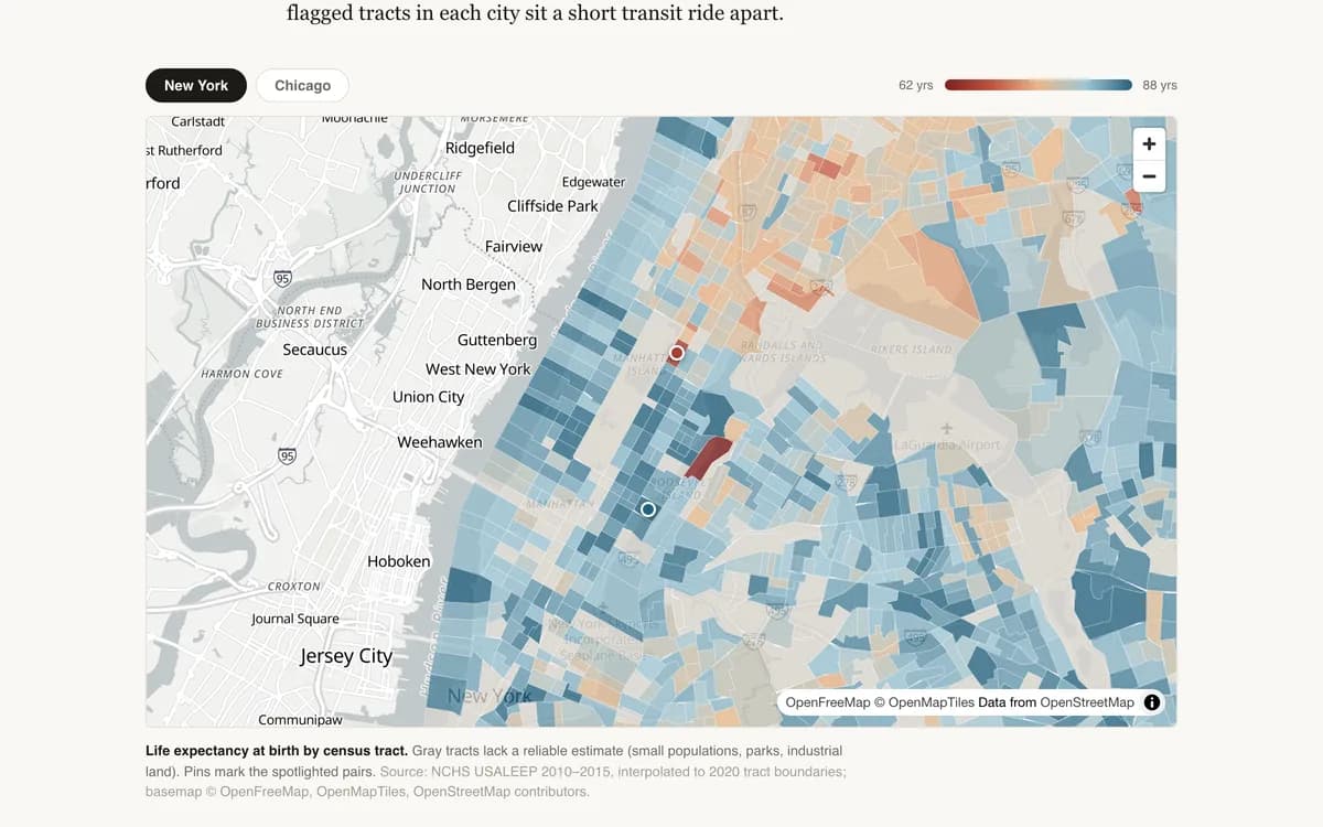
BlogFour Subway Stops, Twenty-Four Years
Within a single American county, life expectancy at birth can differ by more than two decades. A tract-level tour of New York and Chicago.
 Teaching
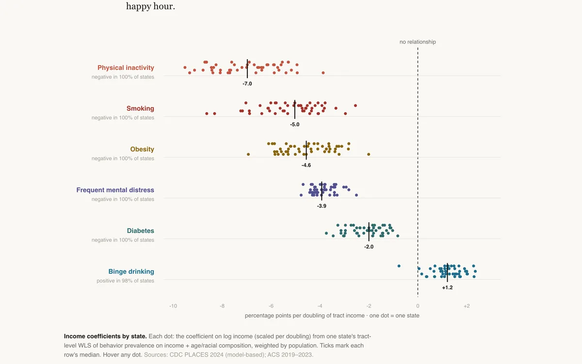
The Coefficient Zoo
Fifty-one regressions per health behavior: what doubling a neighborhood's income does to smoking, obesity, and — running the other way in 98% of states — binge drinking.
 Teaching
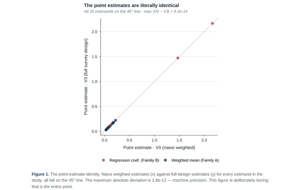
Same Betas, Three Standard Errors · NHANES
One NHANES dataset, four variance machines, and exactly what the naive standard error quietly gets wrong.
 Blog
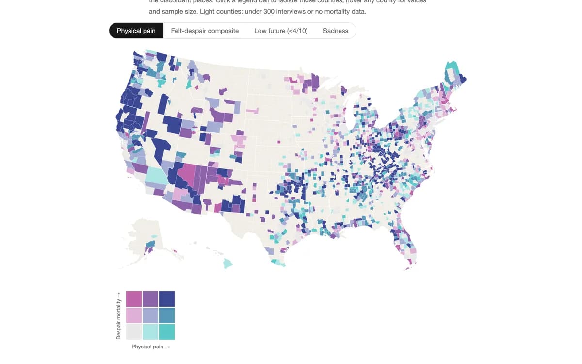
BlogDeaths of Despair vs. Felt Despair
Case and Deaton mapped where Americans die of suicide, drugs, and alcohol. Gallup spent a decade asking Americans how yesterday felt. Lay the feelings over the deaths, and the measure that tracks the mortality map best is not sadness, no…
 Blog
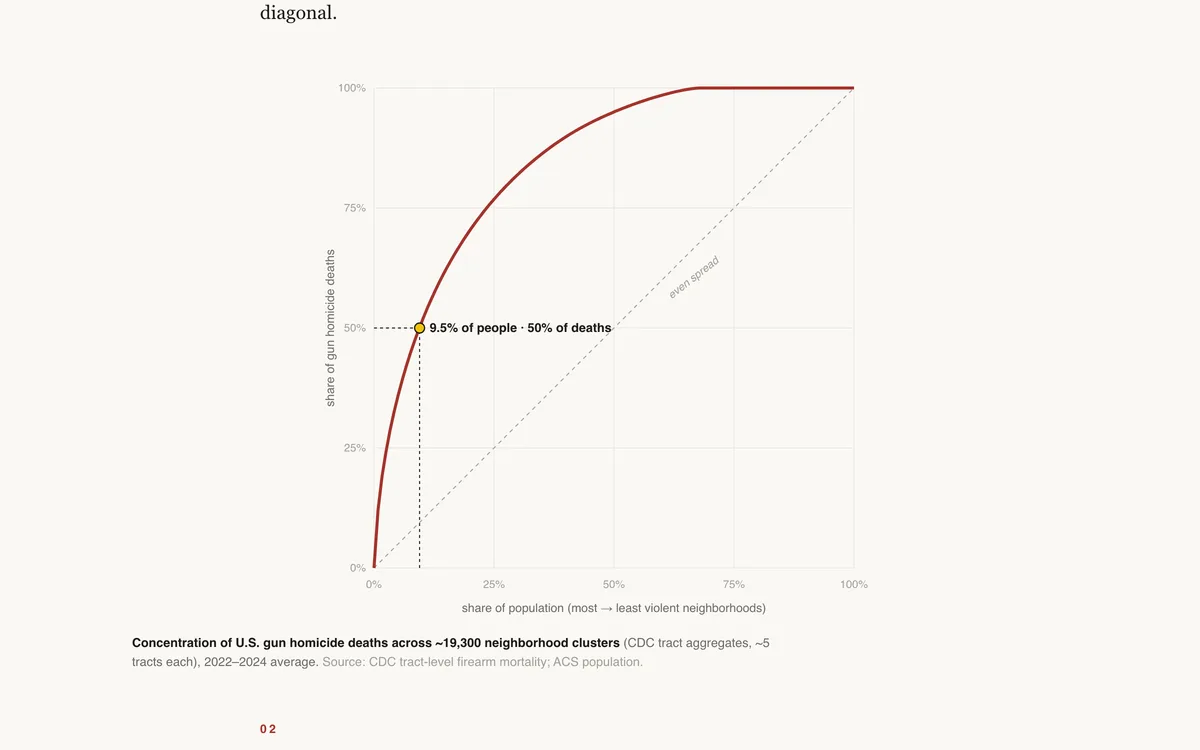
BlogHalf the Deaths, a Sliver of the Map
Half of America's gun homicides happen in neighborhoods housing about 9.5 percent of its people. Lorenz curves and a block-level look at Chicago.
 Teaching
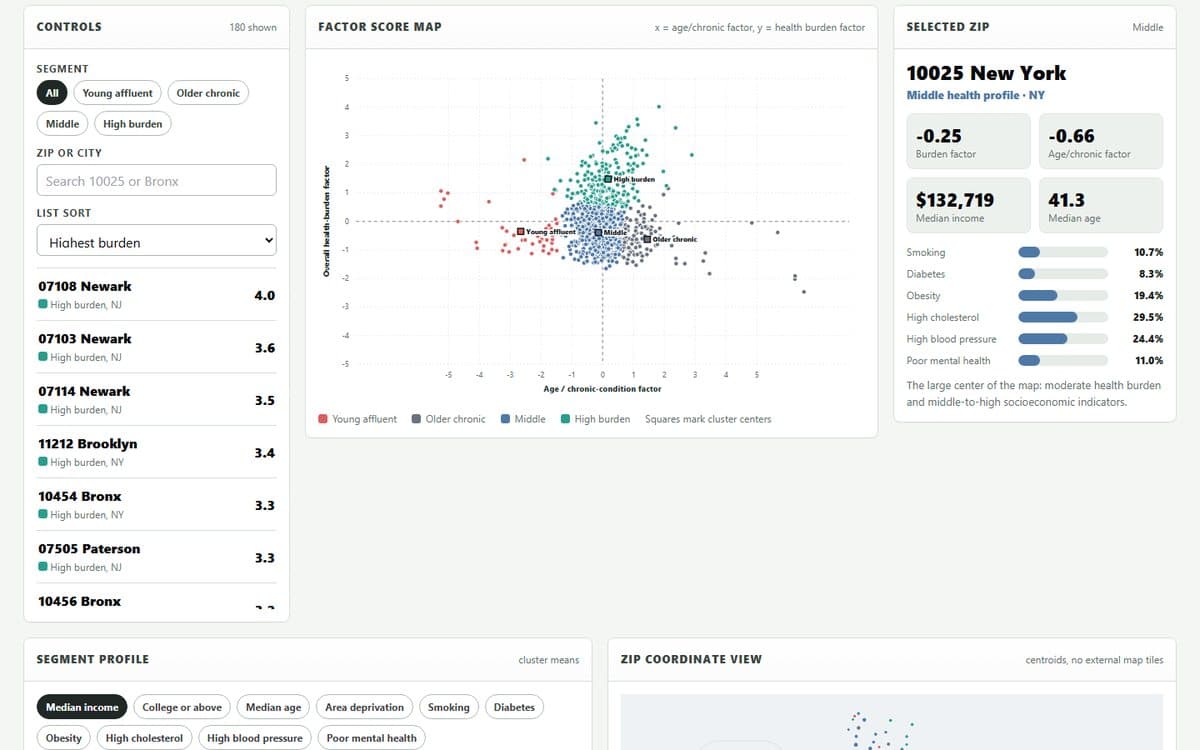
NYC Metro ZIP Health Segments
Use health prevalence measures to build factor scores, cluster ZIP codes, and interpret the segments by correlating scores with income, age, college share, and deprivation.
NYC-area ZIP health teaching data
ZIP-level geography, deprivation, population, education, income, health prevalence measures, and factor scores.
 Blog
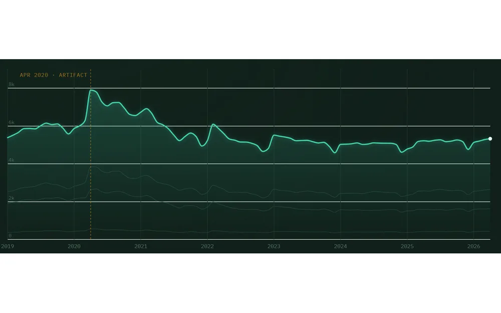
BlogReading the Population's Vital Signs — Mental Health at the Emergency Room Door
What 88 months of syndromic surveillance data reveal about mental health at the emergency department — and how to read a rate without being fooled by it.
 Blog
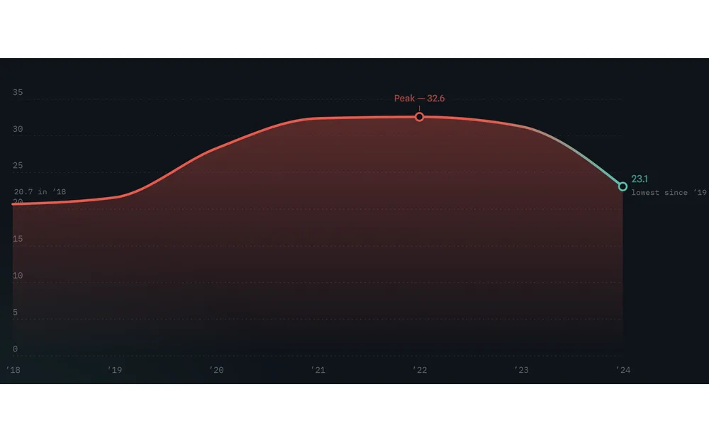
BlogThe Curve That Bent — U.S. Drug Overdose Deaths, 2018–2024
A data narrative on U.S. drug overdose mortality from 2018 to 2024: the fentanyl-driven climb, the uneven toll, and the historic 2024 reversal. Built from CDC / NCHS National Vital Statistics System data.
 Blog
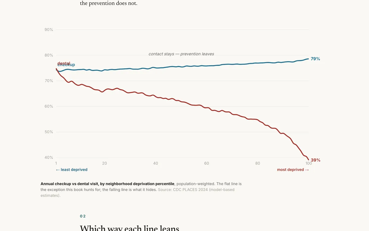
BlogThe Flat Line
In deprived neighborhoods people see the doctor just as often — and get far less prevention. The health system manages disease where it could prevent it.
 Blog
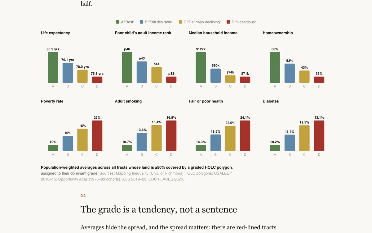
BlogThe Ninety-Year-Old Map
Federal appraisers graded American neighborhoods A through D in the late 1930s. Lay the grades over today's census tracts and life expectancy, child mobility, and homeownership still sort by the colors.
 Blog
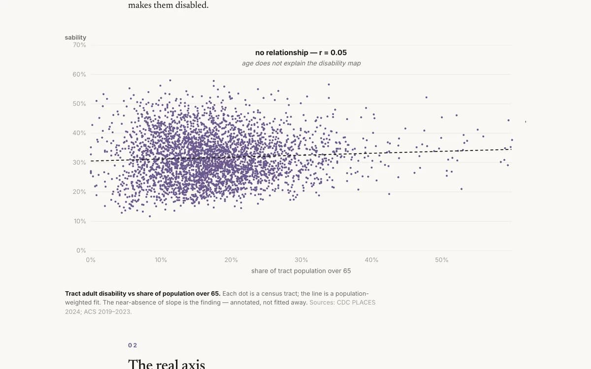
BlogWear and Tear
The geography of disability looks like it should be a map of where old people live. It isn't. It is a map of deprivation.
 Blog
BlogWhat a Year of Life Costs
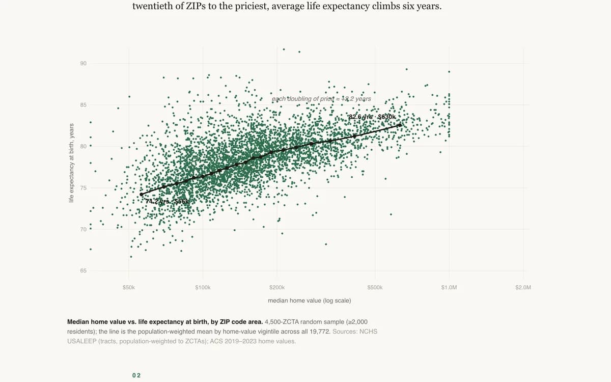
The housing market already prices life expectancy. In Cincinnati, ZIP codes one year of life apart differ by about $18,000 in median home value; in San Francisco, $141,000.
 Blog
BlogWhere It Is Deadliest to Be Poor
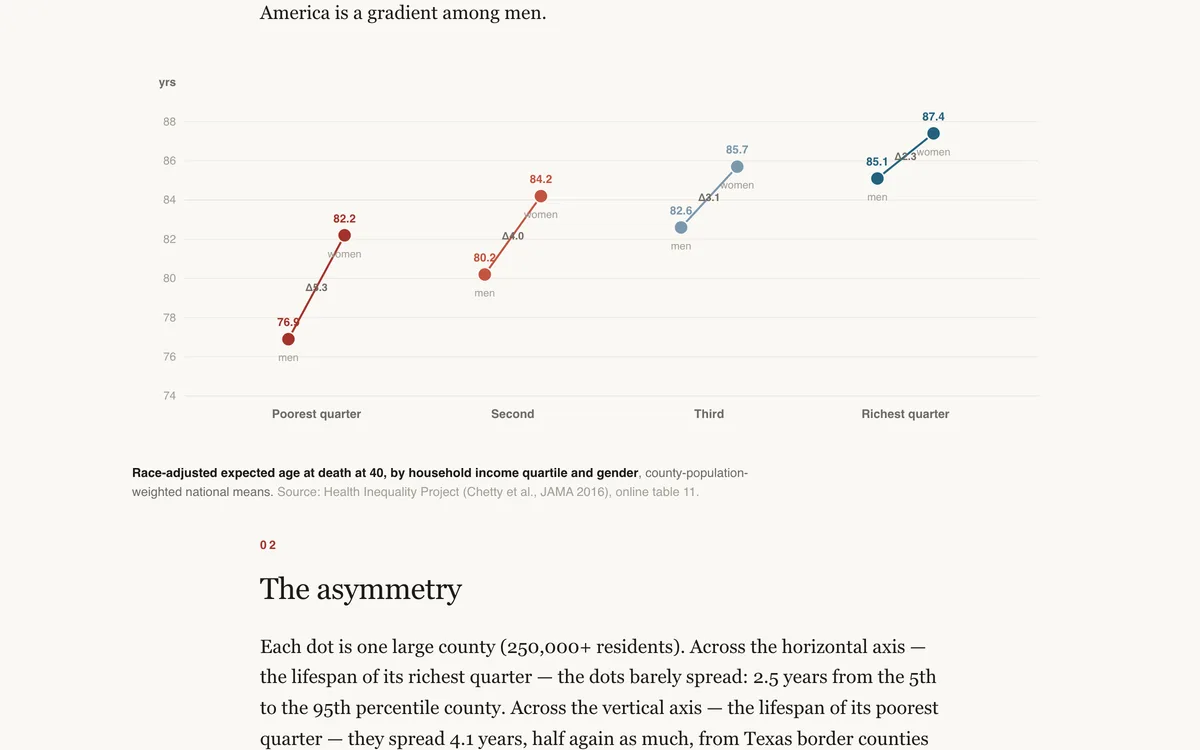
Rich Americans live about as long everywhere. Poor Americans' life expectancy depends on their address — a four-year spread across large counties, correlated with local smoking and obesity, not with local health insurance.
 Blog
BlogA Day on the Plate — How America's Children Eat, Move, and Grow
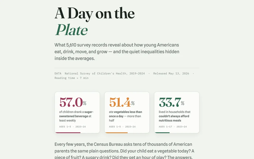
What 5,610 survey records reveal about how young Americans eat, drink, move, and grow — and the quiet inequalities hidden inside the averages.
 Blog
BlogDid Iowa Drink More During COVID?
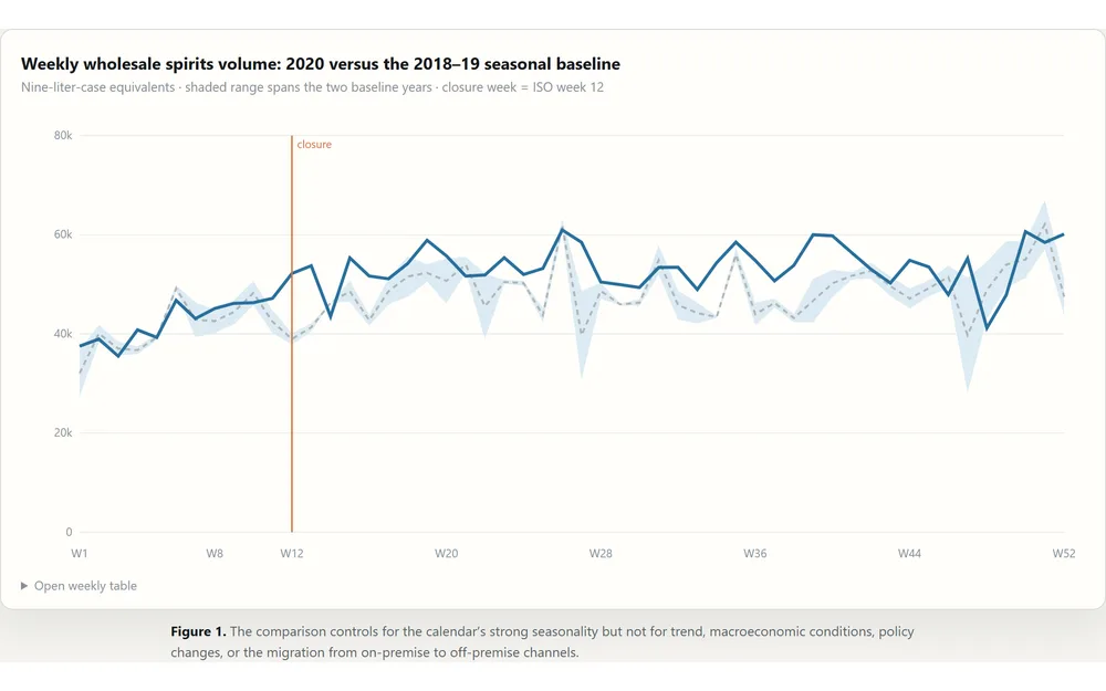
A regression-backed teaching case on Iowa spirits orders, COVID, interrupted time series, and the missing counterfactual.